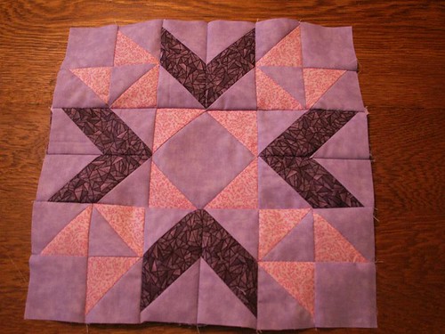
I'm working on using colors other than black, white, or cream for the backgrounds of these blocks. Those are my default backgrounds. I like the purples in this one but I think if I did it again I'd use a medium purple on the points of the inner star to emphasize that design.

I skipped a lot of the HSTs again by using squares and rectangles with corners added.


8 comments:
Such a feminine and sweet looking block.
The colours remind me of the sky at sunset, nice job.
The power of color for me is the emotion it generates. This one generates both softness and intensity. I really like it!
the purple background is wonderful...
I love the colours in this. It feels really warm
I think it evokes elegance. Yours turned out really nice. I also did my own thing with the HST. I think if I tried her system my block would be even wonkier!
Your block is very pretty!
Interesting use of colour. It has a happy feel to it.
Post a Comment